

There are many different strategies that can be used to make profits in the market. Some of them can mean staying invested in the market for several months, while others last a few days at most.
In any case, stock charts are extremely important when it comes to placing an order and buying a stock. A good understanding of these charts allows investors to determine which time is a good buying opportunity and which should instead be used as a waiting period to prepare for a more profitable opportunity.

In addition, stock charts can also be used to find the optimal price range to exit a position. By determining in advance the price range at which the stock will either become “overbought” or encounter resistance, one can greatly increase the number of successful trades and overall returns.
When looking at a chart, two of the most important factors to recognize are resistance zones and candlestick patterns. An analysis based on these factors will help you understand the basics of the stock price behavior and identify potential buy and sell zones.
Types of Stock Charts
Depending on your personal preferences, you can choose between three different types of stock charts: Line, Bar and Candlestick charts. Some of them are more complicated to use, but also more informative, while others are designed to give you all the important information in the chart at a glance.
When considering which stock chart to use, you should think about what information you want to look at and with what accuracy. For example, one important information that many traders pay attention to is the candle wicks (also called shadows) of the candle, which can only be captured with the bar or candlestick chart.
The wicks of a candle are the lines above and below the opening and closing price of the candle and are often used as an indicator of buying/selling pressure throughout the trading session, as they extend to the high and low of the day. For example, a very long wick above the candle is usually an indicator of strong selling pressure and, when combined with a resistance zone, can indicate a price reversal.
Line Charts
The line chart is the simplest type of chart that can be used to track the stock price, as it is a single line that connects the closing prices over a period of time. The main advantage of this chart is the fact that it is extremely intuitive to understand.
For example, line charts are best for taking a quick look at intraday price movements if you have a position that you want to keep open for a few weeks. In this case, you may be interested in understanding the price movement, but you are not overly interested in the opening and closing prices of the candles in small time frames during the day.
However, the biggest disadvantage of line charts is that they are based on an approximation of the price movement. As a result, the investor loses important information, such as the length of the candles’ wicks, possible price “jumps” at the market opening, and the gap between the opening and closing prices.
Bar Charts
Bar charts, also called range charts, consist of bars representing the range between the high and low prices of a period. The opening and closing prices are indicated by horizontal lines.
The main advantage of this type of charts is the fact that the overall presentation of the price movement is much “cleaner” than in candlestick charts, keeping all the relevant information. With bar charts, you can check the opening and closing prices, as well as the wicks of the candles.
Moreover, bar charts are used in most mutual funds as very important information can be added to the bars. Some charting software allows traders to visualize volume and sell/buy pressure next to the candle, which can be used as an additional indicator to better plan your next moves in the market.
Candlestick Charts
Candlestick charts are most commonly used by retail investors and are set as “default” in many charting programs. They are a variation of bar charts that use colors instead of simple lines to visualize bullish or bearish sentiments.
The result of a candlestick chart is a balanced representation of the price movement that contains all relevant information. The biggest advantage of candlesticks is the fact that the colors make it much easier to see patterns, resistance zones and candlestick shadows than is the case with bar or line charts.
Related: Candlestick Patterns Every Trader Should Know
Looking to master the art of reading stock charts and make informed investment decisions? Look no further than eToro, the leading social trading platform. With eToro’s comprehensive suite of tools, including access to various types of stock charts like line, bar, candlestick, and more, you’ll gain a deeper understanding of market trends and patterns.
Stock Chart Patterns
After selecting the type of chart that best suits your trading style, the next step is to determine the trend and relevant zones. Such zones can be helpful in identifying price reversal and breakout patterns and help traders find a profitable entry price.
Stock Trends
An important idea to keep in mind is that price moves in wave patterns, meaning that in an uptrend it does not rise in a straight line and in downtrends it does not fall like a stone
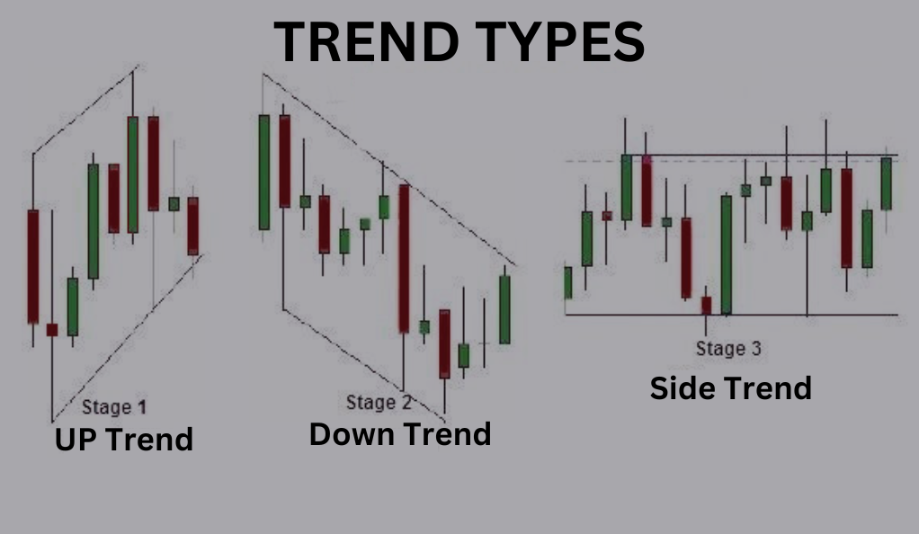
Therefore, an uptrend is defined as a series of higher highs and higher lows. So when corrections occur, the new low should be higher than the previous one, and when prices start to rise again, they should reach a higher high than the previous one.
Similarly, a downtrend is composed of lower highs and lower lows. So despite short market rallies, the price should move further down than before.
The best and easiest way to identify trends is to use a “trendline” that connects two or more highs, and another that connects two or more lows. However, trendlines are only considered meaningful if they connect three or more highs or lows, because if they connect only two of them, they could be very inaccurate or just a coincidence.
Related: How To Spot Trend Reversals Before They Happen
Support and Resistance
Support and resistance are instead horizontal lines or zones that are used to identify a price area where there is strong buying or selling pressure.
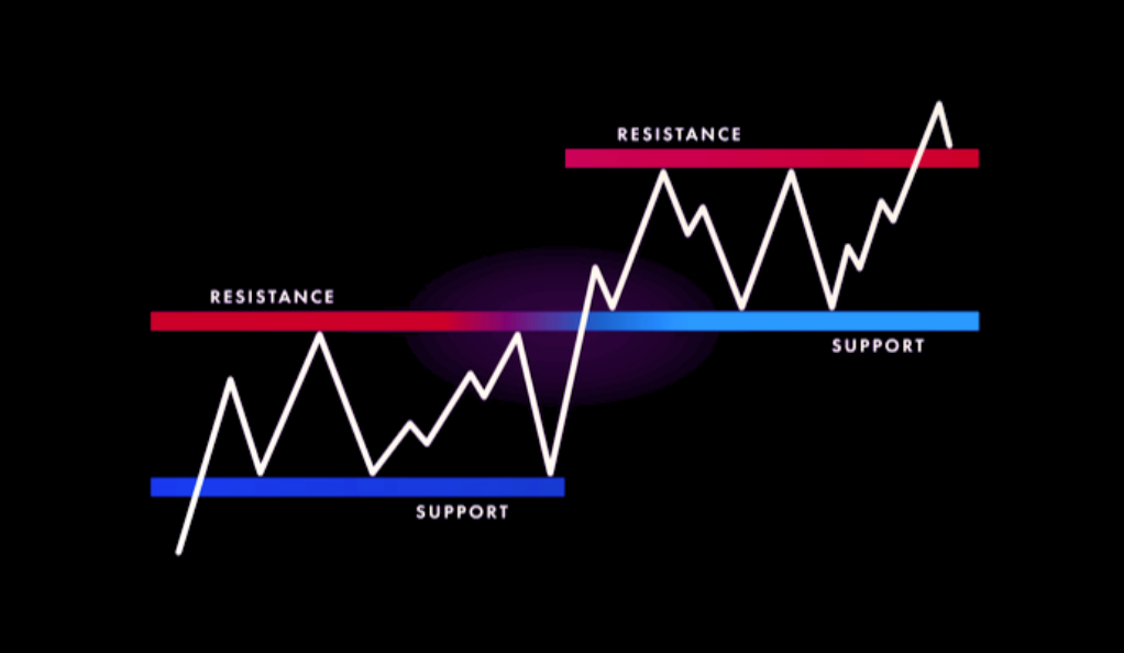
These areas can be easily identified when the chart shows a zone where the stock price tends to bounce and which it cannot break. However, just like trendlines, a zone is only defined as a strong indicator if it has at least three instances where the price was unable to break through.
Support and resistance zones give traders invaluable insight into potential entry points, especially when paired with long wicks of candles.
For example, a classic buy signal is when price has fallen to strong support during an uptrend, the last candle closed green and with a long wick on the downside, meaning that there was strong selling pressure but it was not enough to break through support.
Breakouts
Finally, it might also be the case that a trendline, resistance, or support level fails. These failures can either happen to the upside or downside and they are generally caused by strong optimism or pessimism due to new data, press conferences or headlines.
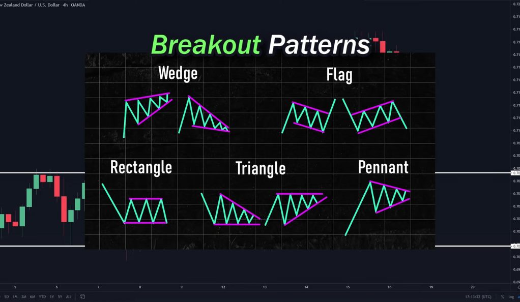
Breakouts are very profitable opportunities, even if they are difficult to detect, because after the breakout the movement is extremely strong, as it is caused by an increase in trading volume.
On the other hand, traders need to be very careful when trading such opportunities, because false breakouts are not uncommon and it could be that the price, after closing outside the zone, returns to it the next trading day.
Related: The Best Breakout Trading Strategy for Successful Trading
Using Multiple Indicators
The last elements that cannot be missing in a trader’s toolbox are indicators. Indicators are important functions that help you determine the most probable price direction for the next trading days based on mathematical data such as trading volume, average price, relative price and much more.
Moving Averages
The most commonly used indicator is the moving average (MA), which is a line connecting the average price of the stock over a given period of trading days. The most common periods are either 20 or 50 days as a short-term indicator, 100 or 150 days as a medium-term indicator, and finally 200 or 250 days as a long-term indicator.
Moving averages have many different functions. First of all, they can be used as a trend indicator. If all moving averages are up, the stock price is in an uptrend in each time frame. However, it might also happen that not all moving averages have the same slope. This could be a sign of a market correction during an uptrend or a market rally during a downtrend.
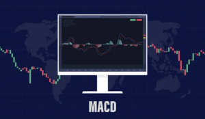
In addition, moving averages can be used as an indicator of a price reversal. This is the case when we can observe a “moving average crossover” when all three moving averages are plotted simultaneously, meaning that a short-term MA crosses a longer-term one. By the way, this idea of crossing moving averages is also used in another indicator, the MACD (Moving Average Convergence Divergence), one of the most popular momentum indicators.
Finally, the moving averages often have the function of support/resistance zones, and during a trend correction, the price tends to move towards the short-term moving average.
Other indicators
It is important to note, however, that one indicator by itself can lead to significant mispricing. Therefore, investors often perform a “cluster analysis” by looking at many indicators at the same time and checking whether most of them point in the same direction or not.
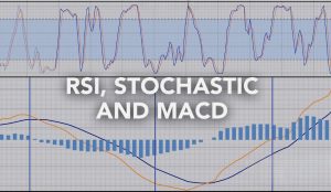
For example, many traders frequently use relative price indicators such as the Relative Strength Index, Stochastic, and Williams Percentage Range, which are used to determine how much the price is overvalued relative to its moving average.
Conclusion
In summary, stock trading, although it may seem intimidating with all its different terminology and possibilities, can be broken down to easily understood concepts such as trendlines, resistance and support zones, and some indicators.
However, before you get into indicators, it’s important to choose a platform and setup that you feel comfortable with. The second step is then to identify the trend and the relevant zones where a price reversal is most likely to occur.
Finally, you should ideally find at least 3-5 indicators that confirm your idea and then place a trade. However, traders must be aware of the potential risk and therefore should always set a stop loss to limit the damage in case the trade does not take the expected course.
FAQ
Which is the best indicator?
There is no “best indicator”, what is best is using a well diversified set of them. For example, every trader should have a couple volume indicators, a couple relative price indicators and a couple moving average indicators.
What is a short squeeze?
A short squeeze is a phenomenon that occurs when the price of a stock unexpectedly breaks through a very strong resistance line where many investors had set their stop loss for their short trades. When the price breaks out, all stop losses are triggered, resulting in a very strong and fast upward movement that usually ends only when all stop losses have been filled.
What are stock splits and how do they affect an open position?
Stock splits are the result of a decision by the underlying company to split a stock into two or more shares, with the trading price divided by the factor of the stock split. Splits have no effect on trading, the only result is that the number of shares you own is multiplied by the split factor, while the price of each share is divided by the same number.
WeInvests is a financial portal-based research agency. We do our utmost best to offer reliable and unbiased information about crypto, finance, trading and stocks. However, we do not offer financial advice and users should always carry out their own research.
Read More